
How I built a custom heatmap with Figma and Tableau
Step by step guide
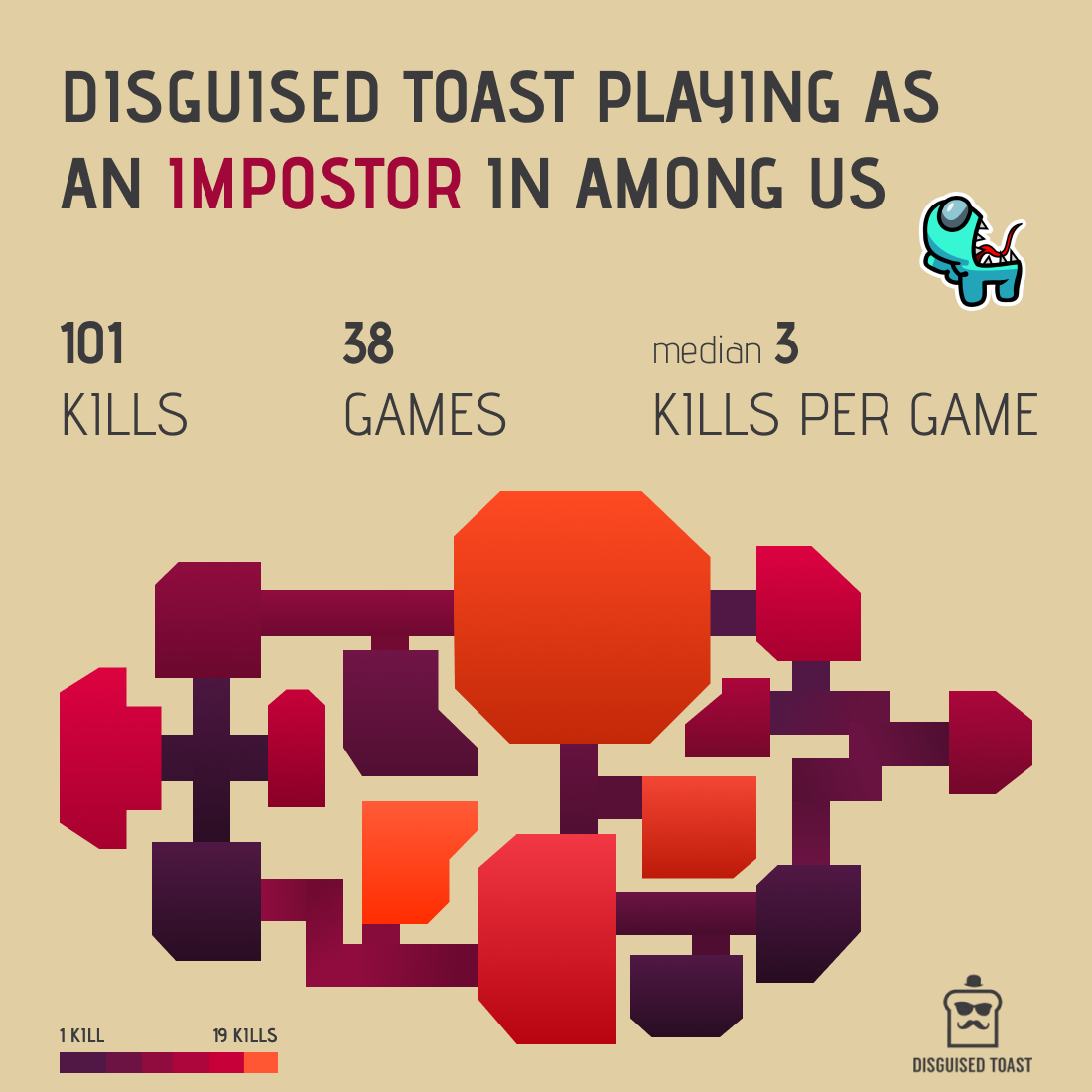
So I got hooked on this game, called AMONG US developed by InnerSloth.
Among Us is a multiplayer game, where you are running from room to room on a spaceship connecting wires, filling the tank, shooting some asteroids and doing other tasks with your friendly crewmates. But be careful! There is an impostor among you. While the crew is working on fixing the ship, the impostor will sabotage the mission and try to sneakily kill everyone. If you like playing detective and connecting the dots, you will love this game - except when you have to be an impostor, that is crazy stressful!
Anyways, to learn more about the game I started watching the Youtube channel of a popular streamer, Disguised Toast. After a couple of videos, I came up with the idea of a visual, mapping out where Toast is killing crewmates the most frequently.
Let’s see the process step by step!
Create a blueprint of the ship
There are 4 different maps in the game, but my favorite is Skeld, the spaceship.
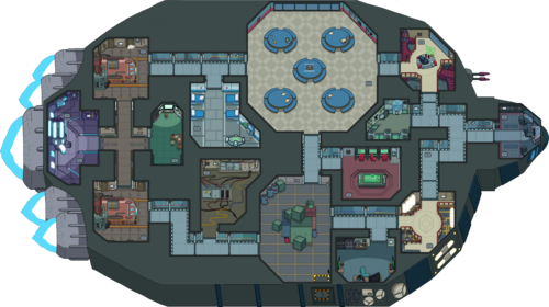 Via Among Us Fandom
I’ve used this red blueprint for the next steps.
 Via Among Us Fandom
Before starting to watch 100+ 20 minutes long videos, I had to figure out, how I will identify the location of each killing, so I created a coordinate system on top of the map.
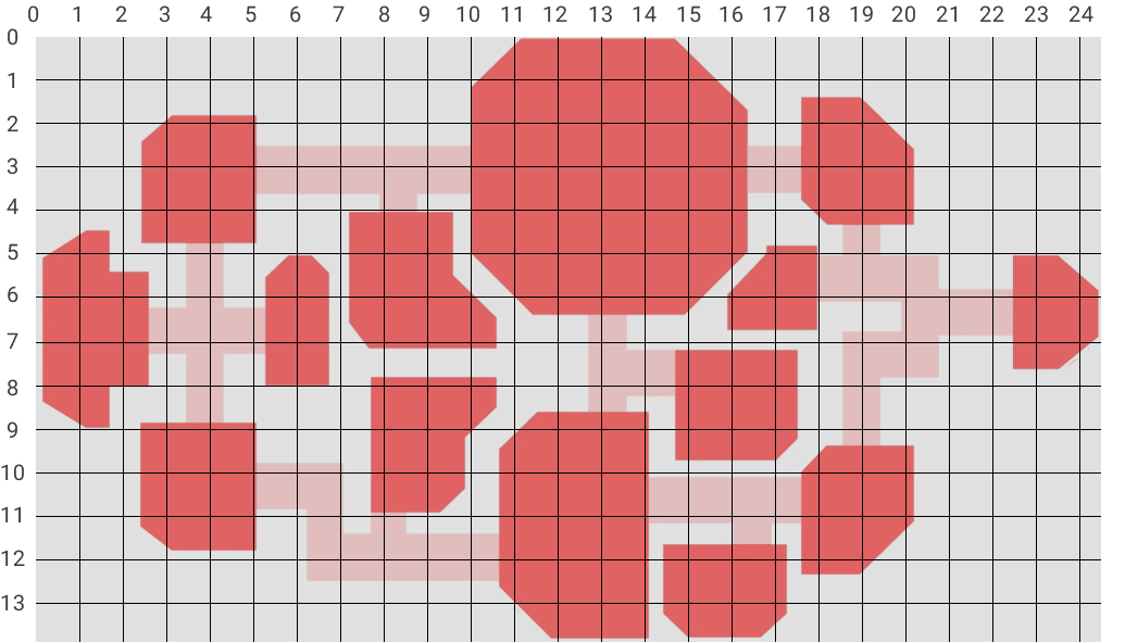
After a couple of videos, I realized that the coordinates should’ve been more granular, but I let those nuances go.
Collect data and map to coordinates
Well, data collection took most of the time. But I had to sacrifice myself on the altar of binge watching.
I’ve noted a bunch of info, like who played in the lobby, who paired with Toast as the other impostor etc. Each room has its name in the Location column (Upper Engine, Cafateria, Admin etc. you can check the full list on Fandom) and I’ve added labels to the corridors too.
After all, I worked with these columns only though:
| Kill | Location | X | Y | Game | Kill per Game |
|---|---|---|---|---|---|
| 1 | Electrical | 10 | 8 | 1 | 2 |
| 2 | Electrical | 8 | 10 | 1 | 2 |
| 3 | Electrical | 8 | 10 | 2 | 2 |
| 4 | Admin | 15 | 8 | 2 | 2 |
| 5 | UE - CAF Corridor | 8 | 3 | 3 | 2 |
| 6 | Reactor | 1 | 5 | 3 | 2 |
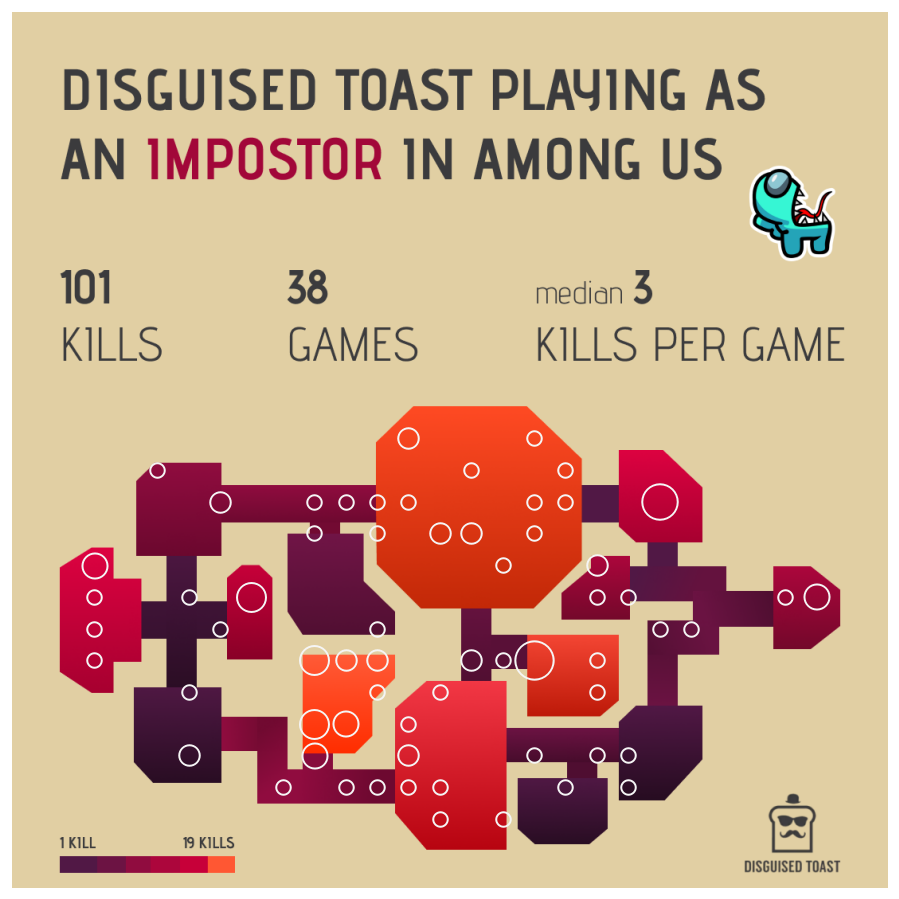
Altogether I planned to capture a 100 kills, which turned into 101 in 38 games. But that’s ok, I can live with not rounded numbers…
Pick a color palette
Ok, if data collection was a long process, figuring out the design took the second longest for sure.
I only knew, that I want to work with something similar then the colors of TIBCO NOW, I just loved how vibrant they are.
 Screenshot captured in 2020
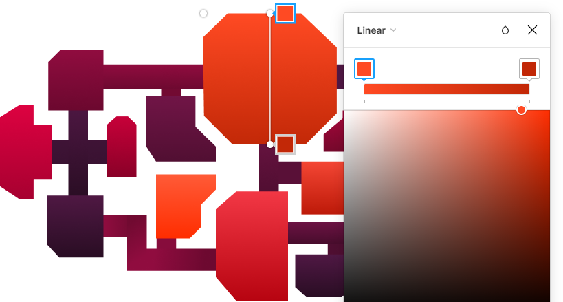
But I also wanted to make a heatmap impression at the first sight, going from purple to a “warm” orange color. So I came up with my palette:

 Create gradient with cssgradient.io
Well, close but not really, huh?
Finalize the heatmap
Once I had my colors, I had to create the background image for the Tableau visualization, which I usually do in Figma.
Since I didn’t find an SVG for the Skeld map, I had to recreate every shape, so I could later fill them with colors.
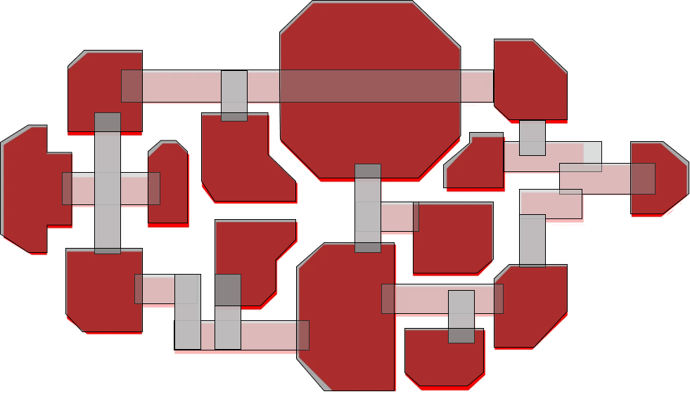
I removed the strokes and set opacity for 100% moving further.
Then I counted the kills for each room and corridors to assign the appropriate color from the color scale. Finally, I played around with a little gradient coloring for each shape to give a 3d effect and to blend the edges of the shapes where possible.

As the last step in Figma, I’ve added a natural background, the title, top metrics, the cyan impostor sticker and the logo of Toast.
Implement in Tableau
Majority of the work’s done by this point.
In Tableau, I created a scatter plot, where simply X goes to Columns and Y goes to Rows. To emphasize the number of kills, circles are sized accordingly.
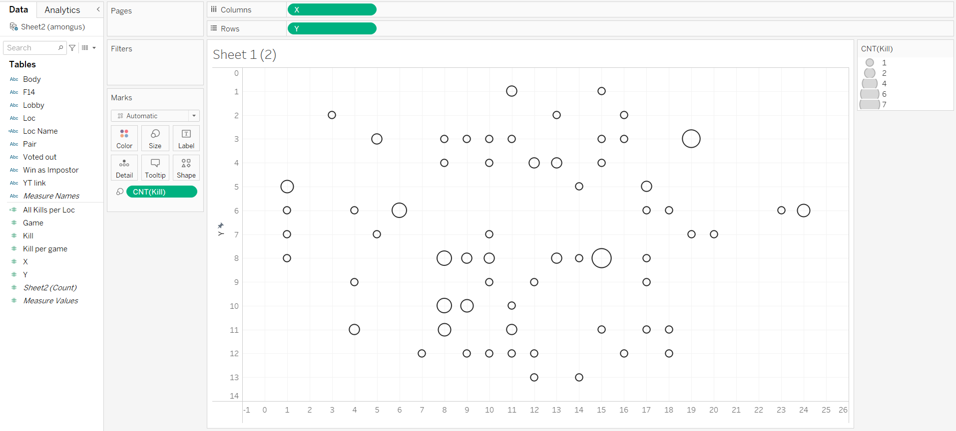
Then, a couple of cleaning steps on the sheet:
- Removed grid lines
- Hidden axis headers and labels
- Hidden the title
- Set the background of the worksheet to None which corresponds to transparent
- Changed the color to light grey which will nicely match with the background image
And the very last step (if we don’t count all the back and forth between Figma and Tableau to align the background and visuals): I added a dashboard with an Image container including my background. My scatter plot is just added on top of that as a floating object.
And voilá!
#IronQuest
Two months ago, I submitted this visual to a cool initiative called IronQuest. In March the topic was about Games. And what happens today? Just when I am about to publish this article, Sarah Bartlett and Kevin Flerlage posted their feedback on the submissions including mine.
I was so excited, I couldn’t wait for my meetings to finish! Here are the major feedback points:
- It would be nice to have an info icon to provide description of the game and the visual –> that is so true. As I played with this game every day and watched a hundred videos, I completely forgot to think about that.
- Text alignment could be centered –> Yes, I’ve tried, but the last textbox in the middle block is just too long compared to the other two. (I wanted to keep this order.) So I preferred an equal distance between the boxes, since I couldn’t place the second to the middle of the page.
- There is a typo in the title –> aaa what a rookie mistake! I fixed immediately.
- Design is great –> thank you!
For the info button: I think the layout is quite compact, and I didn’t want to add an extra object. But it then hit me, that the impostor sticker in the top right pops out so much that it could as well work as a button!
So instead of exporting the sticker with the Figma background, I’ve added as a floating image object with a target URL to this article.
If you’d like to check out the final version, you find it here: